By Dennis Mortensen In Best Practices, Screenshots | June 2024
Screenshot Size Guidelines for Documentation and Help Articles
Guidelines might be too grand a word, but there's certainly some honest input on what to take into consideration when deciding on the sizing for your images. This is not exhaustive, and there are surely other factors one could consider as well.
TLDR; I recommend focusing on the following considerations:
A. Finding the best browser size (and mode) for taking screenshots to ensure the best alignment to user experience and overall screenshot consistency
B. Knowing my knowledge base main container size, so any size optimization I do never falls below this; and
C. Armed with the two factors above, and if there is a desire (or need) for image file size optimization, picking a percentage (not fixed) decrease in size to reduce width (while keeping the ratio intact, of course).
OR, if forced, I would suggest taking all your screenshots from a retina display in a 1536 pixel-wide browser, without any resizing. But then, of course, the entrepreneur in me would advise forgetting about doing this all manually and would instead advise you to use LaunchBrightly to automate the task. 🤗
Browser Size
The first size to consider is the inner window width and height of the browser (viewport size) that your users run your app on. This determines how your app is rendered, including possible invisible or mutated components like navigation, but also positioning, padding, and alignment, etc.
For the best possible recall and confirmation (ensuring the user knows they've landed in the right place), I recommend that the app is rendered in its most recognizable version. This approach can help decrease bounce rates, increase content comprehension, and ultimately increase our deflection rate. In other words, we should open a browser in the same size as our users to provide them with a nearly identical experience, when we take our screenshots.
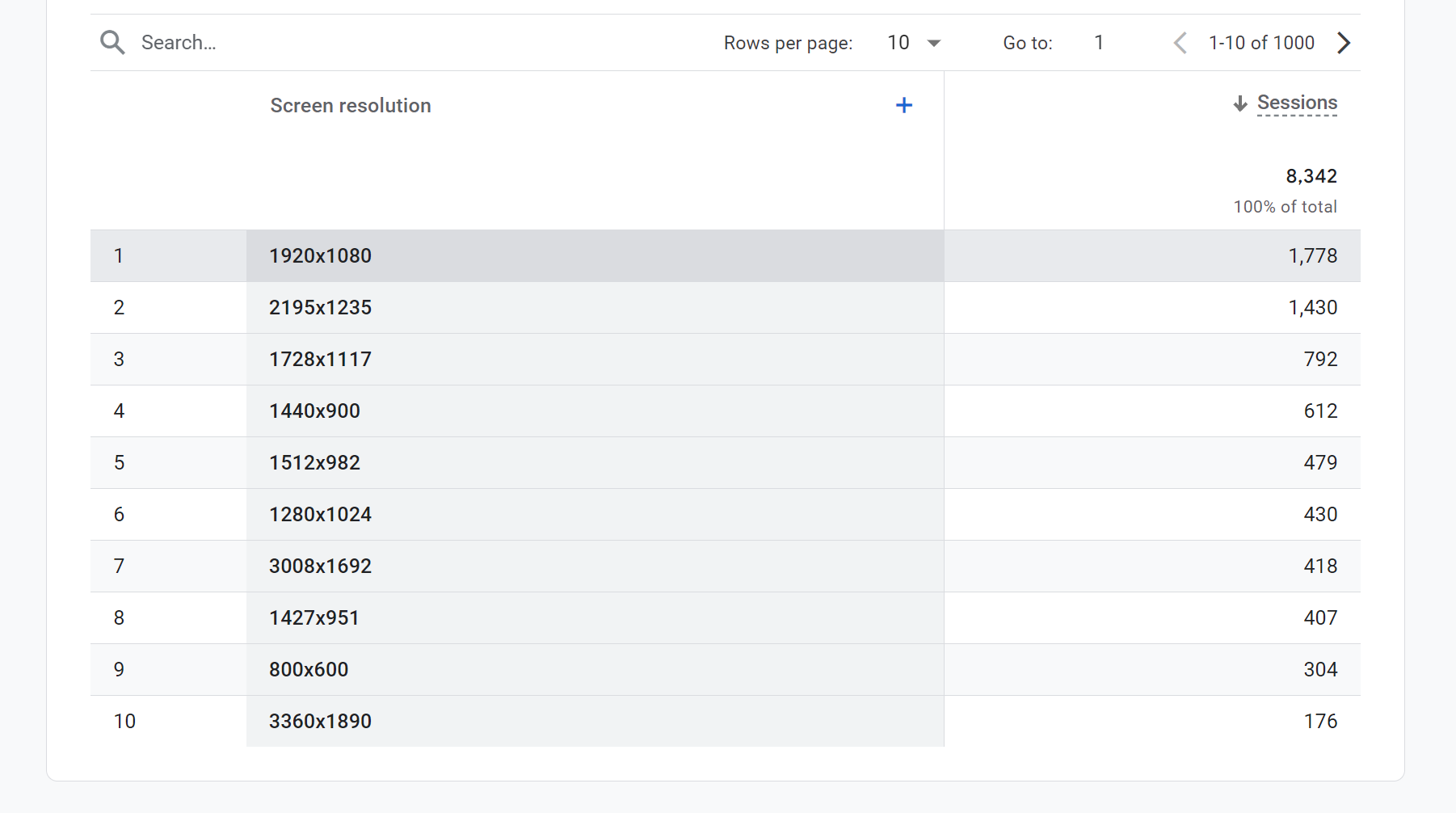
You can find a good proxy for this in your web analytics solution. In Google Analytics, there is a Screen Resolution dimension, which provides a clear understanding of the most used screen resolutions.
Pro Tip 💡
Viewport size is the same as screen resolution if the browser is run in full-screen mode, but you would need to set up a custom dimension to collect this more precise data point.
For our app, it looks like this:
Pro Tip 💡
Both Google Analytics and your browser (when you inspect any element) report this in logical pixels, not physical pixels. To better understand the actual physical pixels, we should also run a report on the most common Device Pixel Ratio (DPR). Most users today likely have a DPR of 2 (also known as a Retina display in Apple terms), which is what you see on a standard MacBook or a 4K monitor.
So when we see a 1920x1080 screen resolution as the most common, we should treat that as an actual 3840x2160 pixels being displayed to the user. That should be the size we use to take our screenshots. We can always resize as needed, but first, we should get the best possible original collateral.
Container Size
The second size to consider is the default size of the main content container in your help center (e.g., Zendesk, KnowledgeOwl, Help Scout, Intercom, etc.). While the content container will vary in size depending on where the article is consumed—mobile, tablet, or desktop—I recommend making image size choices with the largest container in mind, typically desktop mode.
Most platforms will have a max-width for articles, indicating how wide your screenshot can be within it. The template we use in Zendesk designates 66% of 1160px to the body of the article (height is infinite) and adds 30px padding on each side. This gives us 1160 * 0.66 - 30 - 30 = ~706px width.
However, as mentioned earlier, the CSS and the browser work in logical pixels, so the actual pixels needed for a Retina display (DPR=2) are 706 * 2 = ~1411px width minimum to display a screenshot perfectly. Anything less for a full-width image on a Retina/4K screen may appear blurry or pixelated because the original resolution is lower than the displayed size, and the browser will upscale it.
Pro Tip 💡
I highly recommend using lossless image formats like PNG or lossless WebP. These formats maintain high image quality by preserving all original data, which is crucial for detailed screenshots imho. While still doing an honest job on the compression side.
Image Size
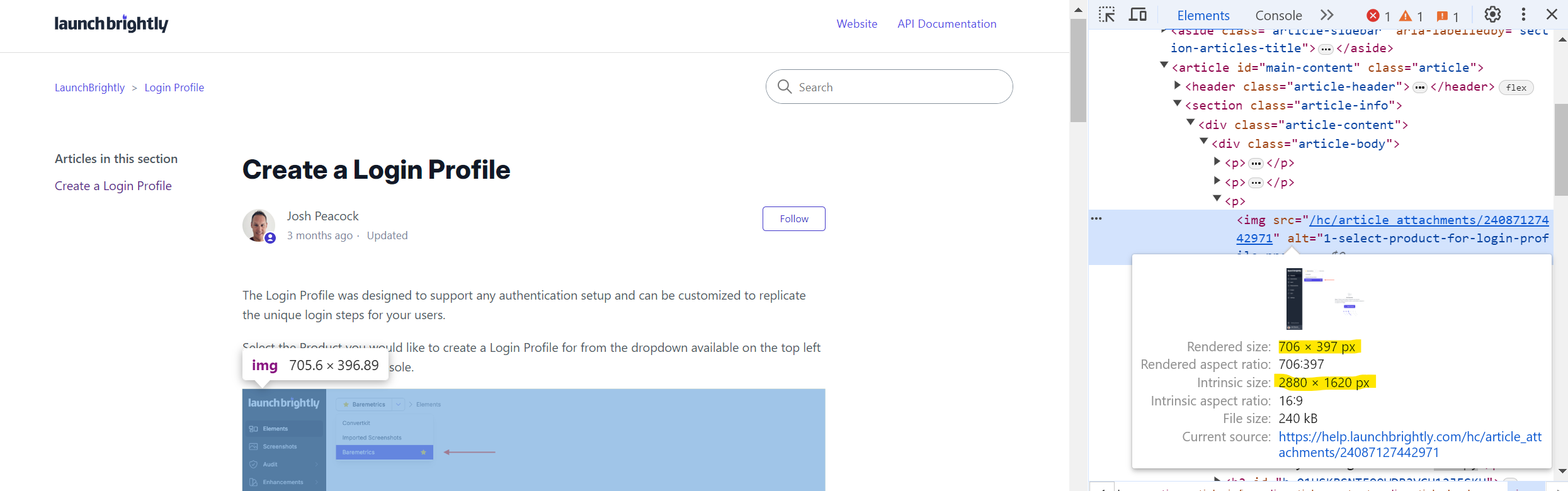
The final size to consider, and to actually answer the question in the title of this post, is what image size one should choose. For full-width screenshots inserted into my Zendesk article (current template), anything below 1411px would introduce lower-quality image collateral. The only strong argument for using a smaller size would be to reduce file size and thereby improve load times.
If the screenshot is larger, the browser will naturally downscale it to fit the container, so even if the intrinsic size of the image, as in my example below, is 2880px, there is no visual harm.
Pro Tip 💡
The file size (time to load) vs. image quality discussion is unique to each company, as their users arrive from different locations. To add some context, consider an imaginary compressed 100 kB screenshot versus the 240 kB example above:
On a 100 Mbps connection, the theoretical load times would be:- A 100 kB image: approximately 8 milliseconds- A 240 kB image: approximately 20 milliseconds
In reality, it will be longer due to network overhead, latency, and other factors. For instance, on my WeWork guest WiFi as I write this, the load time is around ~400 milliseconds. However, since most objects load asynchronously and in parallel, the whole support page loads in less than ~3 seconds.
This makes me skeptical about hyper-optimizing image dimensions. If one must do this (and that's a strong "if" in my book), I'd rather go for lossy image compression first, imho!
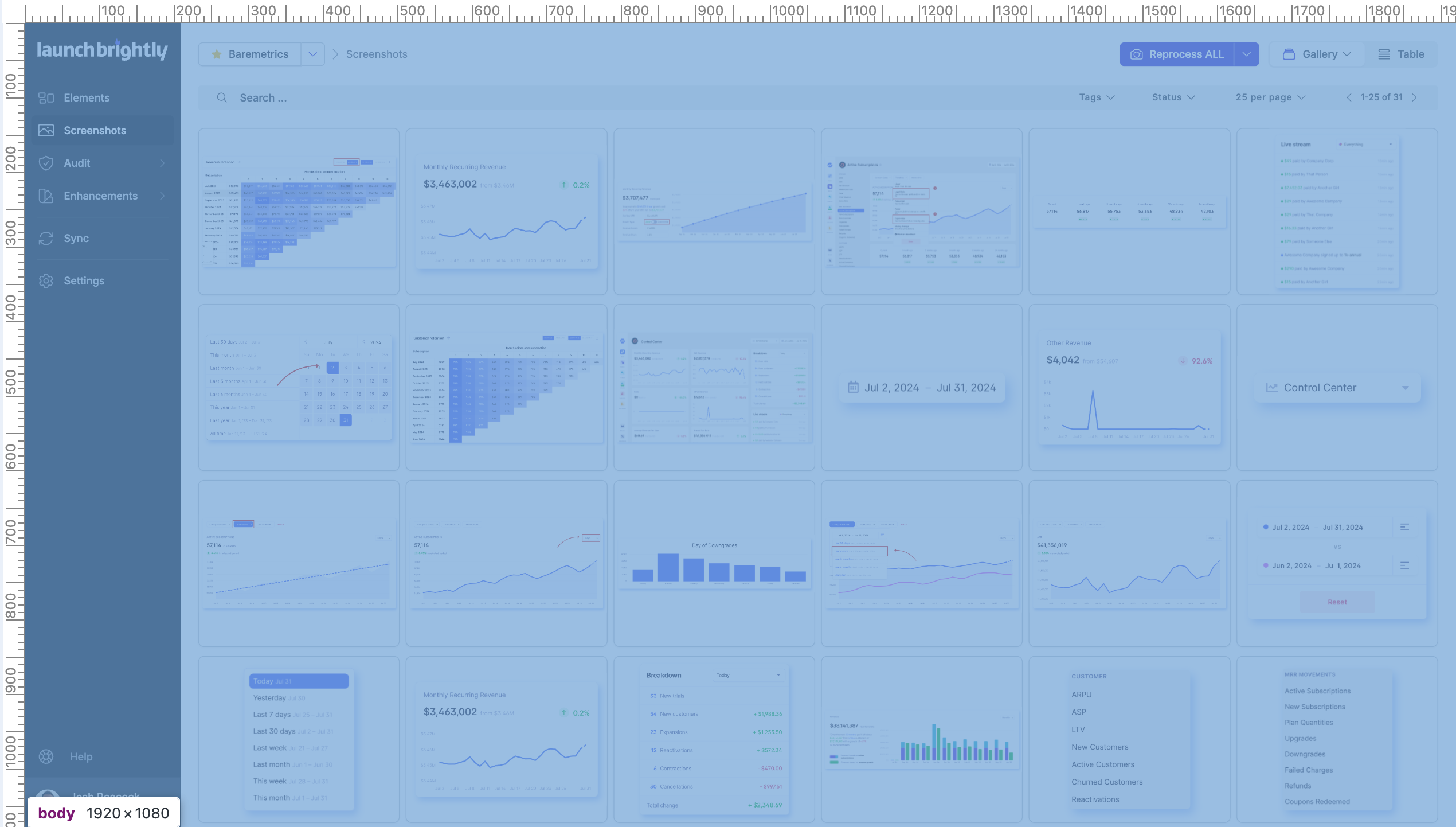
Now, this point is important, as it defends keeping screenshots at higher resolutions. It is almost guaranteed that a set of, or most of, your screenshots will not be copies of full pages but rather some UI element from your App. Say some sidebar from our App below:
This is a 512 logical pixel-wide sidebar (1024 physical pixels when rendered on a retina display, or actually 1174px width given the automated styling applied). If I display this at full width in my Zendesk container, which is 1411px, I am already upscaling it and making it slightly blurry. Not cool! Of course, here I would go half container width (as I did above) or just actual size when inserting into an article.
I would be remiss not to mention this: we take all this and more into consideration when automating screenshots over at the LaunchBrightly pixel factory. If you're curious to know more, I'm happy to geek out about it on a Zoom call. Or if you just want to see our tool in action and enjoy a quick peek behind the curtain!