By Josh Peacock, Dennis Mortensen In Newsletter | August 2024
Choosing the right screenshot size for your help docs
Newsletter 8
Our newsletter from August 6th, 2024. Feel free to sign up to get this directly in your inbox
Our friend Reagan Helms from Planning Center posed a really great question in the Support Driven community recently, asking for recommendations and best practices for screenshot sizing in docs and help articles. This is a tough question to answer! And surely there are many different factors one would consider. But there was an uncomfortable truth in the statement Reagan attached to this question:
It's very jarring to have so many different-sized images in an article.
There is no escaping this! Inconsistent sizing of screenshots in support articles or other docs is not only jarring on the eye, but worse, it can also distract your users and draw attention away from the help documentation itself and make it more difficult for your users to find the answer to their question. The very reason they arrived on the article to begin with.
Given the impact this can have on user experience, we’d love to share a handful of the key considerations we think you should focus on when deciding on the size of the screenshots in your help docs. Here’s where we landed!
Identify your users most common browser size
Your product screenshots are the most immediate way a user identifies what a support article is trying to help them resolve. It lets them know they have landed in the right place to solve their issues. To maximize user recall and confirmation, we therefore recommend that you choose a browser size (i.e. the inner window width and height of the browser, aka viewport size) that renders your App in its most recognizable version. An approach that can help decrease the bounce rate on your articles, increase content comprehension, and improve deflection rates.
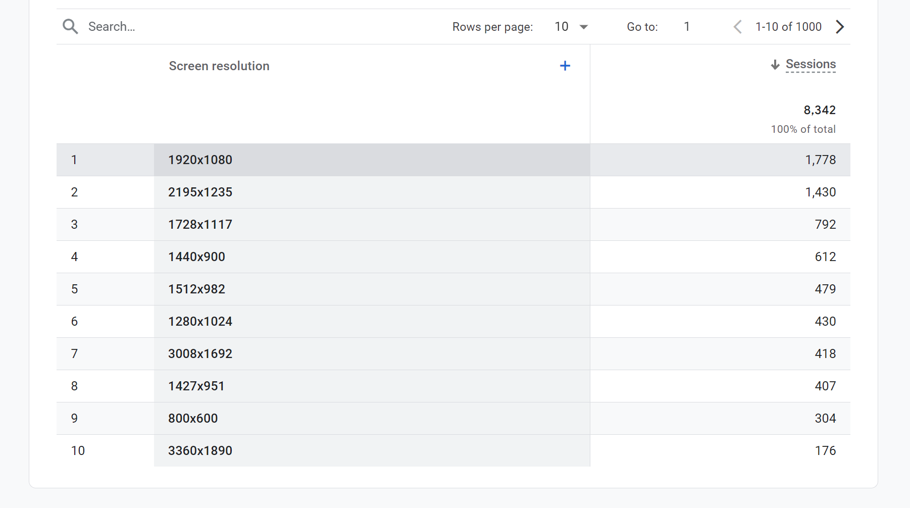
You can find a good proxy for this in your web analytics solution. In Google Analytics, there is a Screen Resolution dimension, which provides a clear understanding of the most used screen resolutions. For our LaunchBrightly App, it looks like this:
Pro Tip 💡
Most users today will likely have a Device Pixel Ratio (or Retina as Apple describes it) of 2, which is what you will see on a standard MachBook or a 4K monitor. So when you see, for example, a 1920x1080 screen resolution as the most common in the screenshot above, you should reasonably assume that 3840x2160 pixels are actually being displayed to your users and this the size you should capture your screenshots.
Knowledge base container size
Now that we have a good sense for the most common browser size with which you users render your App, the next sizing consideration is that of your help center platform (Zendesk, KnowledgeOwl, Help Scout, Intercom, et al). While the container size will vary depending on whether the article is viewed on a mobile, tablet, or desktop device, it's best to make image size choices with the largest container in mind, typically the desktop mode.
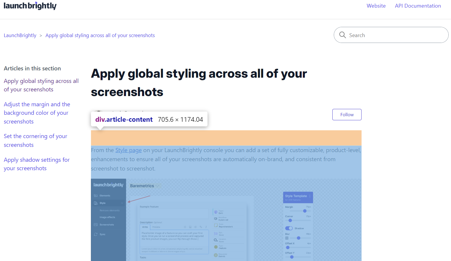
Most platforms have a maximum width for articles, which dictates how wide your screenshots can be. For example, the template we use in Zendesk allocates 66% of 1160px to the body of the article (height is infinite) and adds 30px padding on each side. This calculation gives us an article container size of: 1160 * 0.66 − 30 − 30 = ~706px width
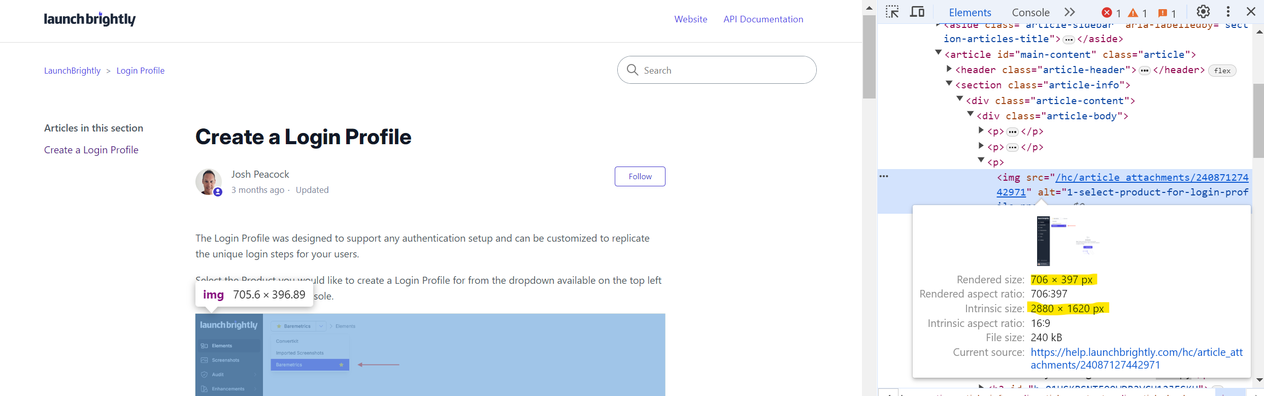
Keep in mind however, as mentioned earlier, most users will likely have a Device Pixel Ratio (aka Retina) of 2 meaning the width to display a screenshot perfectly in this example is 706 * 2 = ~ 1411px. Anything less for a full-width image on a Retina or 4K monitor may leave you with a blurry (or pixelated) screenshot as the original resolution is lower than than the displayed size, and the browser will upscale it.
Below is an example image from our Zendesk help article on custom styling.
Pro Tip 💡
We highly recommend using lossless image formats like PNG or other lossless formats (e.g. WebP) as these formats maintain flawless image quality, even after multiple edits and saves, which is crucial for images where fine details and text clarity are important. Like the product screenshots in your support articles!
Choosing the optimal image size
The final consideration, and actually answering the question presented, is the image size you should choose. Continuing with the example from our Zendesk article above.
If you choose any image size below 1411px, for full-width (page) screenshots, it will reduce the quality of your image collateral. Which is not what we want. However, if your screenshot is larger than 1411px, the browser will naturally downscale the image to fit the container. So, even if the intrinsic size of the image is larger than the 1411px (as in the example below), there will be no harm to the visual quality of your screenshot as the browser downscales it.
We therefore recommend you do not choose an image size below the maximum container size (scaled to Retina) of your help center for full-width screenshots.
Now, it is very likely that some subset (perhaps even most) of your screenshots will not be of full pages but rather of some smaller UI element from your App. Say, for example, some sidebar from your App like below:
This sidebar is 512px wide (which, again, we should factor as being 1024px when rendered on a Retina display). Displaying this sidebar at full width in our Zendesk container, which is 1411px, would see it automatically upscaled making the images slightly blurry. Not cool!
So in these instances, we recommend making the images either half or a quarter size of the container width, or maintaining their actual size when embedding them into an article.
Automate your screenshot sizing!
There are many factors to consider here. But it is important to make a choice on the desired screenshot size for you, and stick to it. Which can, sometimes, be easier said than done! Applying this consistently, on every single screenshot, and ensuring all teammates follow the same guidelines can be difficult. No matter how well intentioned we are. At LaunchBrightly we take all of these factors into consideration when automating product screenshots, and allow you to fully customize the unique dimensions you would like us to render your App to generate screenshots. If you’re curious to learn more about automating your product screenshots, or for a quick peek behind the curtain at our tool, feel free to ping us at hello@launchbrightly.com.
If you’d like to chat more about how to find the right size for your screenshots feel free to reach out. We’d love to help find the right mode for you! 🤓