By Dennis Mortensen In Best Practices, Screenshots | July 2024
Should Screenshots and Images Come Before or After the Text in Documentation?
When crafting end-user documentation and customer support articles etc., one crucial consideration is the placement of screenshots and images. Should they precede or follow the text that references them? The answer to this question significantly impacts the clarity and usability of your documentation.

TLDR; An introductory text should always precede the screenshot to provide the user with context and help them understand what they are about to see.
Context Matters! Setting the Stage for Screenshots and Images
The primary rule for effective documentation is to ensure that the reader is never confronted with something incomprehensible. This applies to all forms of content, including text, code samples, diagrams, and screenshots. Thus, providing some explanatory text before a screenshot or image is generally advisable to give readers the necessary context.
Generic implementation
- Before the screenshot: Introducing the screenshot with a brief description helps the reader understand what they are about to see.
- After the screenshot: Following the screenshot with more detailed explanations can clarify any specific elements within the image.
This structure—context-setting text, followed by the screenshot, then detailed explanations—ensures a smooth flow of information and helps prevent confusion.
The Type of Documentation and Reading Path
The ideal placement of images and screenshots also depends on the type of documentation and how readers will interact with it, such as (not exhaustive):
- Narrative documentation: In linear documents like user guides, information flows sequentially. You provide introductory text, followed by the screenshot, and then any additional details. This ensures readers have the context before seeing the image and can follow along easily.
- Technical reference manuals: Readers often jump to specific sections without reading sequentially. Therefore, it’s essential to provide sufficient (typically more than other types) context before the screenshot so that the image makes sense on its own.
- ...
Practical Norms and Placing Conventions
In practice, the convention is to place text that sets the stage before the screenshot, followed by detailed text referring to the screenshot. This approach is effective whether or not figure numbers and captions are used.
Placing screenshots or images mid-sentence (e.g., “In this screenshot: [image] we see...”) can be distracting and is often better avoided. Readers tend to treat images as their own “paragraph,” so it’s generally more reader-friendly to place them at the end of a sentence or at best at the end of a paragraph.
Annotations: Enhancing Clarity in Larger Screenshots
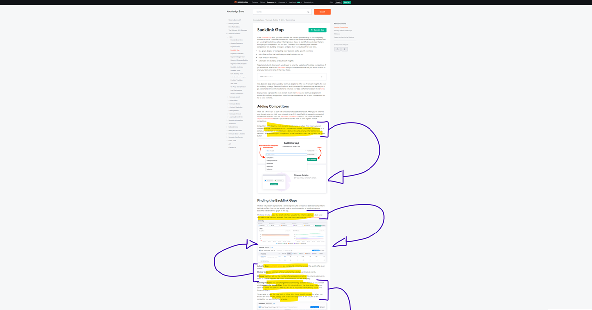
When dealing with larger screenshots that provide extensive context, annotations such as rectangles, arrows, and enumeration circles can be highly beneficial. For annotations, it is generally best to place the explanatory text before the screenshot. This way, readers have the necessary context and understand what to look for in the annotated screenshot. After the screenshot, you can include additional details if needed, but the initial explanation should always come first to guide the reader effectively. This approach prevents readers from having to jump ahead or even back and forth between the text and the screenshot, enhancing their understanding and flow of information.
However, it's important not to overload a single screenshot with too many annotations. Over-annotating can overwhelm the reader and reduce clarity. Instead, consider splitting complex settings into multiple screenshots, if possible. Each screenshot should be small enough to be easily comprehensible without the need for excessive annotation. The complexity of the application being documented will dictate the level of detail required in each screenshot and annotation.
Exceptions and Special Cases
There are plenty of exceptions to the rules (comments) above, especially in documents where images serve as supplementary material (e.g., system schematics). In these cases, images can be placed more freely since the text does not directly depend on them, and they do not rely on the text for context. They function almost as a map for the reader.
Conclusion
By following these guidelines (and bending them into supporting your unique setting), you can create documentation that is both informative and user-friendly, ensuring that your readers have a seamless and comprehensible experience.
Automation
However, all of this effort can be undermined if your screenshots are outdated. To maintain the accuracy and relevance of your documentation, consider automating the capture of screenshots and using software tools to audit changes in your application. This ensures that your visuals stay current, not just saving you time, but ensuring your users are not confused when looking at outdated collateral (aka rotten product screenshots)
I would be remiss not to mention that we've spent significant time perfecting the screenshot automation process and implementing all the audit governance you would expect. If you're curious to know more, feel free to email me — or if you just want to see our tool in action and enjoy a quick peek behind the curtain, pick a time below!
Cheers
Dennis 😊