By Josh Peacock In Best Practices | April 2024
Should you use borders around screenshots in your help docs?
Whether or not you should add a border around your images can be a matter for hot debate! There are many factors that influence the different styling options you chose for your images, including the subject matter and message you are trying to convey. But, ultimately, it often boils down to personal taste and the aesthetic that best suits your eye.
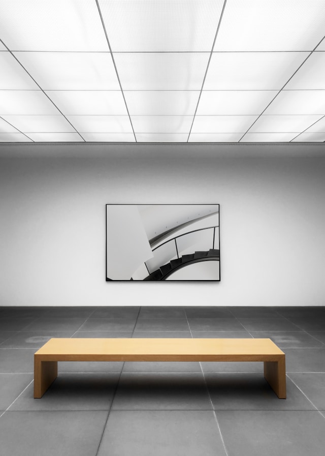
When it comes to including borders around the product screenshots in your help documentation, the factor we have generally found to be most important is ensuring that your screenshots do not blend, or match, the background of your documents. For example, if the background of your application and your help documentation platform are both white, the product screenshots of your application (with the white background) will blend into your help documents.
Product screenshots that blend into the background of the help documentation where they live can create confusion for your users and distract away from what the screenshot is trying to communicate to the user. More often than not your help center will be designed to match your company’s brand identity, using customizable components like logos, icons, fonts and colors to create visual consistency with your application. It is therefore important to ensure your users do not mistake the content in your screenshots as elements of the help center which could detract away from the overall effectiveness of your help documentation. And this is where including borders around your product screenshots can help!
To avoid any of that potential user confusion, we have found that it comes does to a choice between:
- Using a thin dark gray border around the outside of your product screenshots; or
- A subtle shadow to provide depth, contrast and clarity to the screenshot and help page.
We therefore recommend applying either of these options to provide a clear visual delineation between your product screenshots and the text in your help documentation, and reduce potential user confusion.
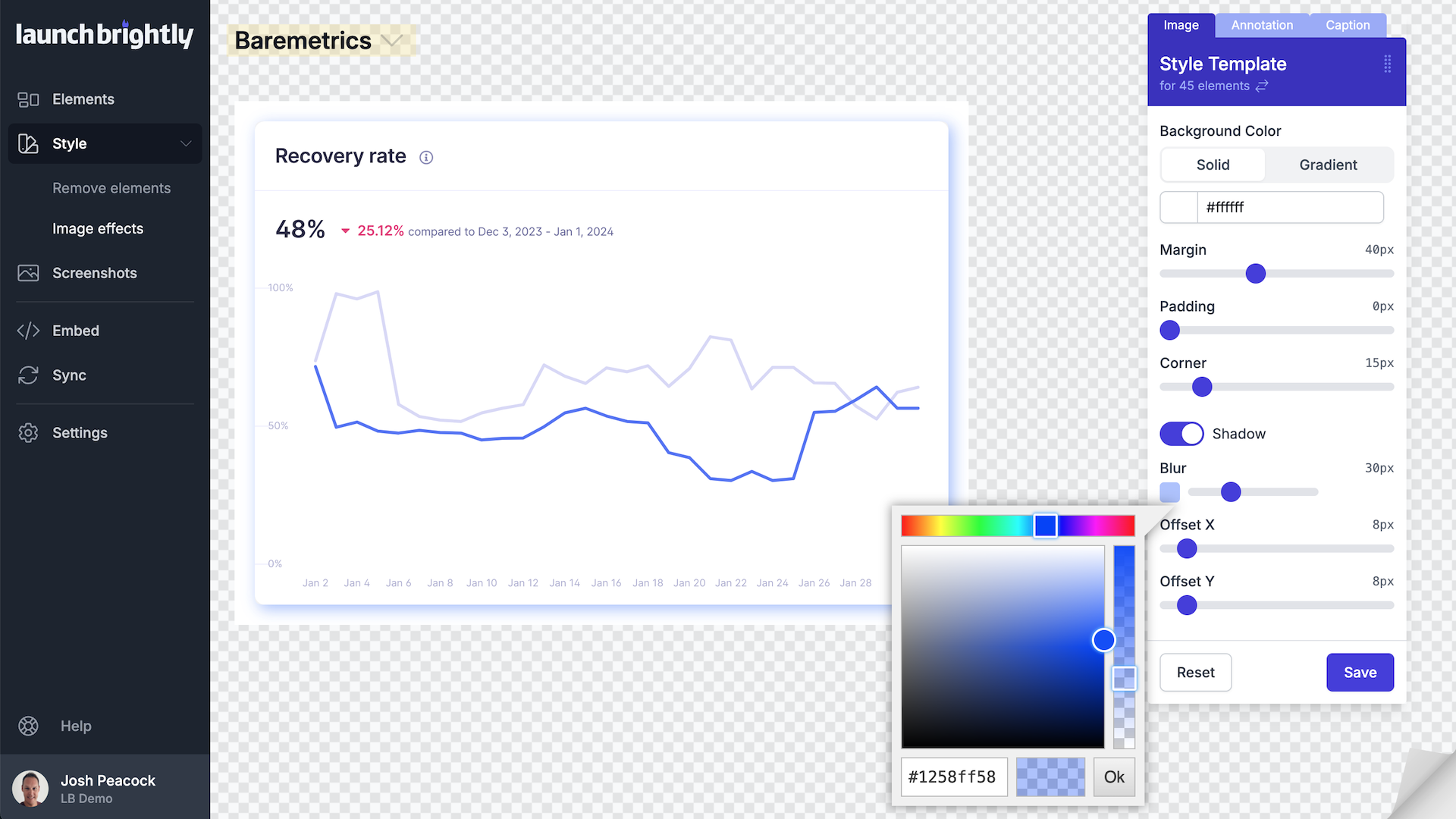
One consideration you should never have to worry about when deciding to include borders around your product screenshots is possible changes to your company’s brand guidelines, like a change of color or styling. Using LaunchBrightly’s fully customizable styling templates, you can adjust your margin settings, use background colors or gradients, and add shadows to your screenshots in line with your brand guidelines and to evaluate the overall visual appeal of your screenshots. And if you need to change the style of your screenshots. No worries. Simply adjust the styling of your templates as needed and reprocess all of your screenshots with the click-of-a-button to have the platform automatically generate new screenshots reflecting your style adjustments.
Ultimately, the choice on whether to include a border, or shadows, to your screenshots is a matter of personal taste. We’ve been fortunate enough to be able to bounce our ideas off a number of technical writing experts who have been generous enough to share their thoughts and to help spark conversations. A topic we are super passionate about!
And here are a few comments from the experiences of some of those technical writing guru’s from a Reddit thread on this topic to help you decide on what works best for your particular use case.
Robin G. Coles
I worked for one company where they had their own style guide. In that it specifically stated whether or not to use borders around screenshots. I don't remember which one it was. However, we also used a paid version of the Snipping Tool. This allowed us to make a new screenshot of the image we needed to capture, then either add or remove the border.
If the company you're at has a their own style guide I would check that first and maybe update it. If not, then maybe you can create one for them based on what works and doesn't work there.
Check out more great content on Technical Writing from Robin's website: https://RobinGColes.com
Ruby Singh
I used a very thin grey border. It's subtle but works well and avoids the harshness of using black.
Charming_Solid_3523
It depends on the screenshots pictures. If the background screenshots has a lot of white, I'd prefer to add borders to distinguish it from the docs background.
You can see more about the new product Charming_Solid_3523 is working on to effortlessly generate docs websites at: https://www.spreading.ai/
Crendogal
I use a 1px black line done using Google Docs formatting (or Word formatting on our older docs) That is, unless I've got large callouts (done in Snagit) that go over the boundary of the screen area. It annoys me to see a box around the whole area, not just the screen area.
But now that you have me thinking about the images with no edges....if I have time on my current project I may go back into some of the screen shots (thank you SnagIt, for having that lovely library feature) and put a box around the screen grab piece under the callouts just to make the actual screen area more obvious.
Stup0r
One of the first things I did with my new employer is one of the things I accomplished with a previous one, which is to put a clean thin border around screenshots.
Anonymous
1/2 pt black border on all images, per my style guide
I have a Word macro for applying 1/2 point black border to all images in a document if you would like me to send it to you. Its just one button press
Fshpsmgc
In our Antora theme we can specify if we want to enable a border per image. Both border and image can be specific to dark mode as well.
So, if the image has a white background in light mode, I enable it. If it already has a natural border (for example a screenshot of a Windows popup) or it’s something with a transparent background (like a flowchart) I tend to disable it.
But usually I just try both and see what’s more readable.
KaiSosceles
All more of the same here. 1px black border because white interfaces getting lost in white docs backgrounds. We also often screenshot small parts of an interface where the natural UI design lines are interrupted and having the 1px black border cleans up and contains those interrupted lines.
I also think it looks dated, but its a slight negative aesthetic tradeoff for fixing other worse aesthetic problems.