By Josh Peacock In Best Practices | September 2025
A guide for understanding ADA compliance in your help docs and screenshots
When designing and maintaining your product the Americans with Disabilities Act (ADA) provides the frameworks for ensuring your digital content is accessible to everyone, including users with disabilities.
What is ADA compliance?
ADA compliance refers to meeting the standards set by the Americans with Disabilities Act to ensure that your product, and associated digital contents, is accessible to individuals with disabilities. These guidelines are further defined in standards like the Web Content Accessibility Guidelines (WCAG), which outline best practices such as providing text alternatives for non-text content, ensuring keyboard navigability, and maintaining sufficient color contrast. For SaaS companies, that not only means designing your product with accessibility in mind — but also ensuring that support resources, like your help documentation, also follow accessibility guidelines.
Key considerations for accessibility
When aligning your product and help documentation to ADA and WCAG standards, there are several key areas to focus on:
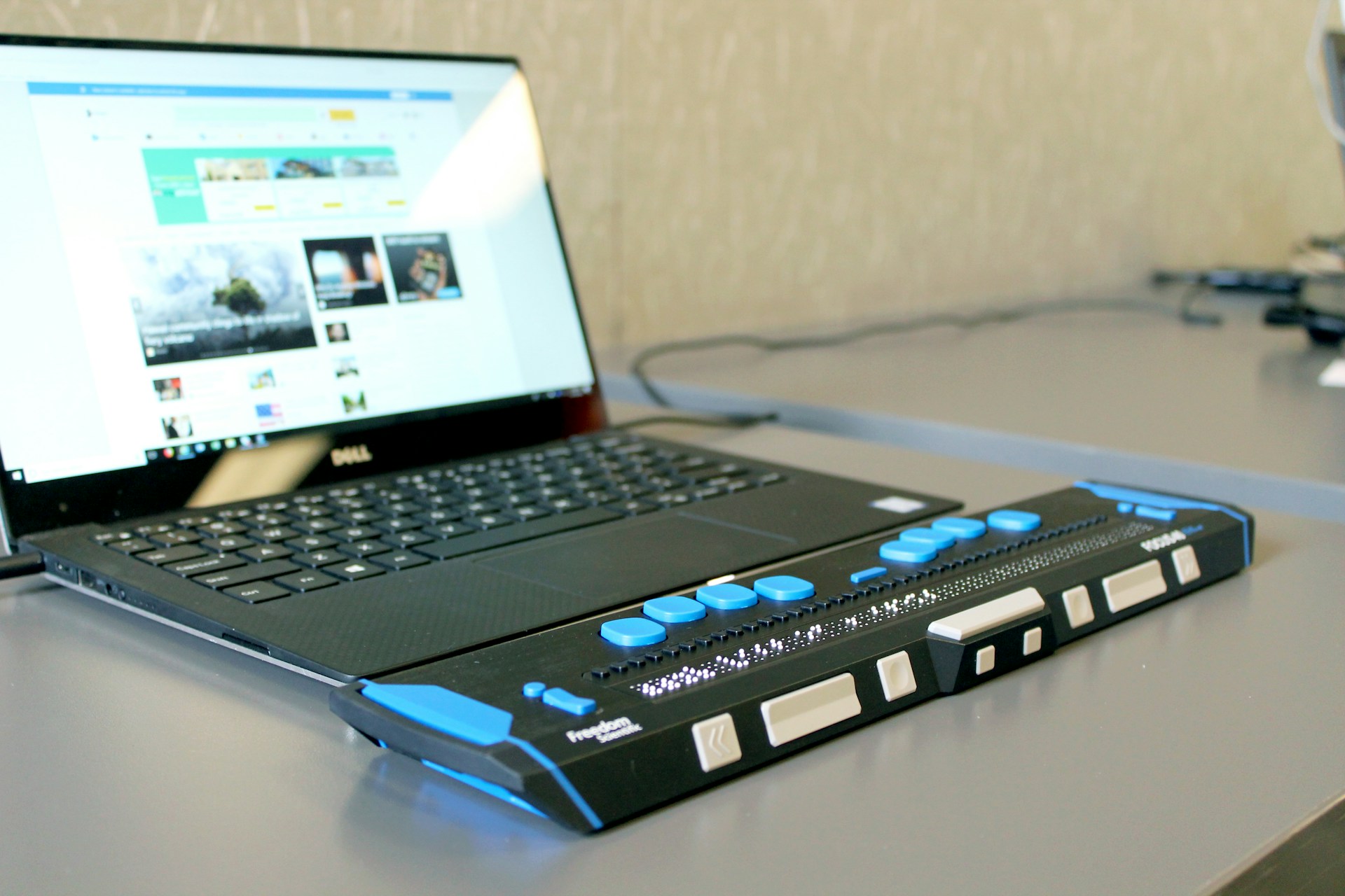
- Text alternatives: all of your images, including your product screenshots and unscripted visuals like schematics and static graphics, should include descriptive alt text that provides meaningful context for screen reader users.
- Color contrast: your UI and product interface elements (including when displayed in your screenshots) should meet the minimum contrast ratios to ensure readability for users with visuals impairments.
- Keyboard navigation: ensure that your product, and your help documentation, are fully able to be navigated using a keyboard to allow accessibility for those users who are unable to use a mouse.
- Structured content: use semantic HTML tags and clear heading hierarchies to help screen readers interpret your content clearly and accurately for your users.
- Consistent layouts: predictability and consistency in the design of both your product and your help documentation helps users with cognitive disabilities to navigate and understand your platform and support materials more easily.
Why screenshot accessibility matters
Screenshots are one the most important elements of your help documentations — they are a vital way of communicating to your users what to expect and how to interact with your product. They can also be one of the easiest places to fall short on accessibility.
The importance of alt text
For a visually impaired user, the alt text you include with the images in your documentation is a crucial way to communicate what the image contains and conveying context for how it relates to the written instructions in the article. However, for many of us, applying alt text to your visuals in your documentation is all too often overlooked. Despite our good intentions, it can sometimes be the unfortunate reality of the manual processes that many documentarians are forced to rely on. Taking time and care to apply good alt text and title attributes when a product visual is initially created — only to see this slowly declines as the images are required to be manually created many times over.
That’s why, at LaunchBrightly, we provide the ability to easily add captions and alt text to all of your visuals — ensuring the alt text is always embedded with your screenshots whenever they are automatically updated in your help center, and giving you the confidence of knowing you will always be ADA compliant.
Consistency of screenshot elements like annotations
Just like your written content has a voice and tone guide, your visual content should follow a style guide too — especially when it comes to screenshots. A style guide ensures that your visuals are both accessible and consistent, improving clarity and reducing cognitive load for all users. Crucial not only for ensuring your help center matches your corporate identity, but also for ADA compatibility.
Using LaunchBrightly custom styling templates you can define your style guide to consistently apply a set of visual enhancements to all of your product screenshots — ensuring they always adhere to ADA best practices:
- Define a consistent color to be used on all your annotations, and select the desired thickness of your screenshot annotations and offset around each annotated element to maximize accessibility;
- Customize the margins and padding to maintain spacing around the edges of screenshots to improve readability; and
- Apply drop shadows and borders to visually visually separate screenshots from background content — without creating distractions or impairing contrast.
Maintain quality with lossless PNGs
The quality of your screenshots plays a huge role in user comprehension — lossless PNGs preserve every pixel of your UI with crystal-clear fidelity, ensuring that small interface details and fine text remain sharp and legible. And, importantly, they support color contrast compliance. If you’ve built your product using accessible color combinations, those contrast ratios should remain intact in your screenshots. Compressed or low-resolution formats like JPEG can introduce artifacts or blur that compromise legibility — especially for users with visual impairments. At LaunchBrightly all of the screenshots we sync directly with your help center will be lossless PNGs so the product visuals in your help documentation will always reflect the quality of your platform and any color contrast or visibility standards you deploy across your platform for ADA.
Final thoughts
ADA compliance goes beyond meeting legal requirements — it’s about delivering a better experience for every user. Clear, high-quality visuals paired with meaningful alt text, consistent styling, and accessibility-conscious design make your product more intuitive and usable for everyone. By building with accessibility in mind, you're not just supporting users with disabilities — you're improving clarity, usability, and trust across your entire audience.