By Josh Peacock In Best Practices, Screenshots, Automation | February 2026
Screenshot margins in documentation: best practices and common pitfalls
The margins around your product screenshots matter more than you think. A practical guide to creating clear, consistent, and annotation-friendly help documentation.
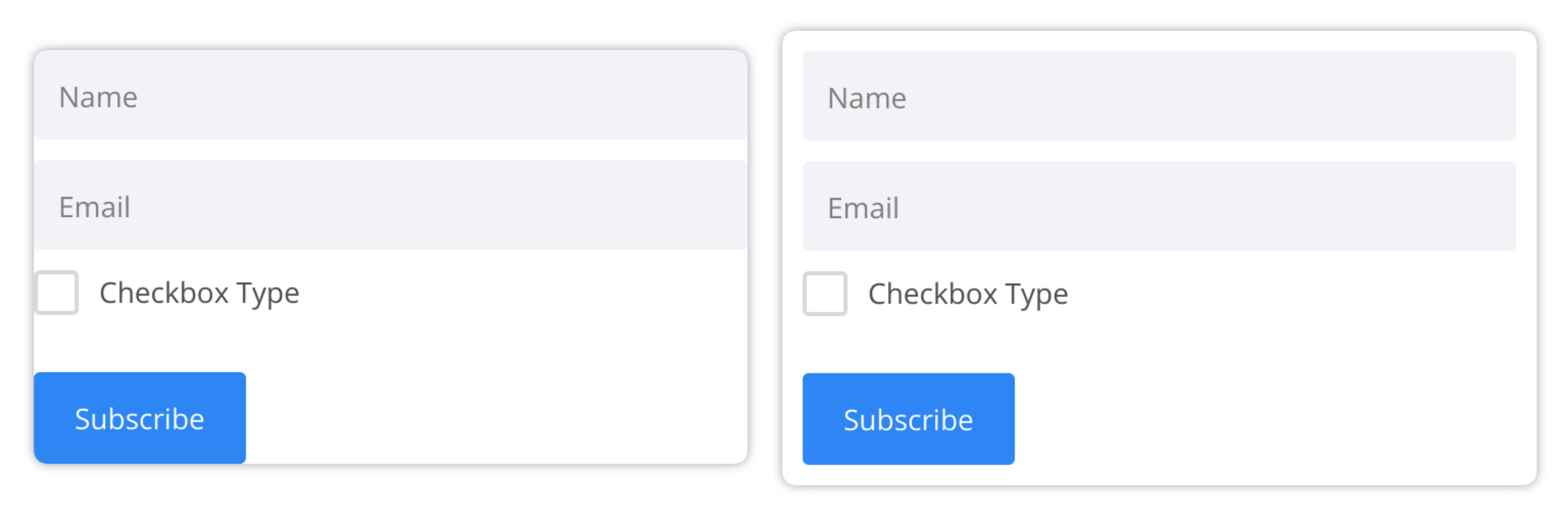
When teams think about screenshot styling, margins can often be an afterthought. It’s easy to assume they’re unnecessary — or that tighter is better. At first glance, screenshots with no (0px) margins can feel clean and efficient: screenshots are captured edge-to-edge around the target UI element with no wasted space. While this is technically valid, your product screenshots don’t exist in a vacuum. In practice, your screenshot margin decisions can play a larger role in your documentation workflows than they first appear.
In this post, we’ll explore some of the key factors you should keep in mind when deciding on whether to apply margins to the product screenshots in your help documentation.
The hidden cost of edge-to-edge screenshots
Product screenshots rarely live in isolation. They’re often annotated, embedded inside help articles, placed within responsive layouts and viewed across a wide range of devices. Removing margin removes the visual buffer that allows those screenshots to adapt cleanly across those different contexts.
Visual tightness and the illusion of cropping
The whitespace around screenshots is not wasted space — it’s a framing device for the images used to communicate key concepts to your users.
When a screenshot has no surrounding whitespace (a 0px margin), the captured element can feel cropped — even when it isn’t. The absence of breathing room can make your images look overly tight and visually abrupt, rather than intentional. Your users might interpret this as something being cut off or unfinished — undermining their confidence in the content and diminishing the perceived quality of your documentation.
Reduced visual scannability and layout variability
Your help center is full of important information that enables your users to find the answers to their questions independently and self-serve. They are dense collections of text, callouts, tables and visuals — all competing for attention.
When screenshots are captured with a 0px margin, they tend to blur into the content around them. Without the visual separation margin affords, it can become harder for readers to visually parse sections, hone in on key steps or to easily understand where one idea ends and the next begins. Margins create rhythm, hierarchy and contrast — critical ingredients for scannability.
This challenge is compounded by downstream layout variability. Once screenshots are embedded in help articles — as well as when used in other guides, blogs or knowledge base widgets — they inherit the padding (or lack thereof) of the surrounding content. If the host layout is also tight, a zero-margin screenshot amplifies the problem which can lead to a cramped and unbalanced reading experience for your users.
Adding margin at the time of screenshot capture acts as insurance. It provides a consistent visual buffer that helps screenshots adapt gracefully across layouts you don’t fully control — preserving clarity, readability and visual structure wherever your screenshots live.
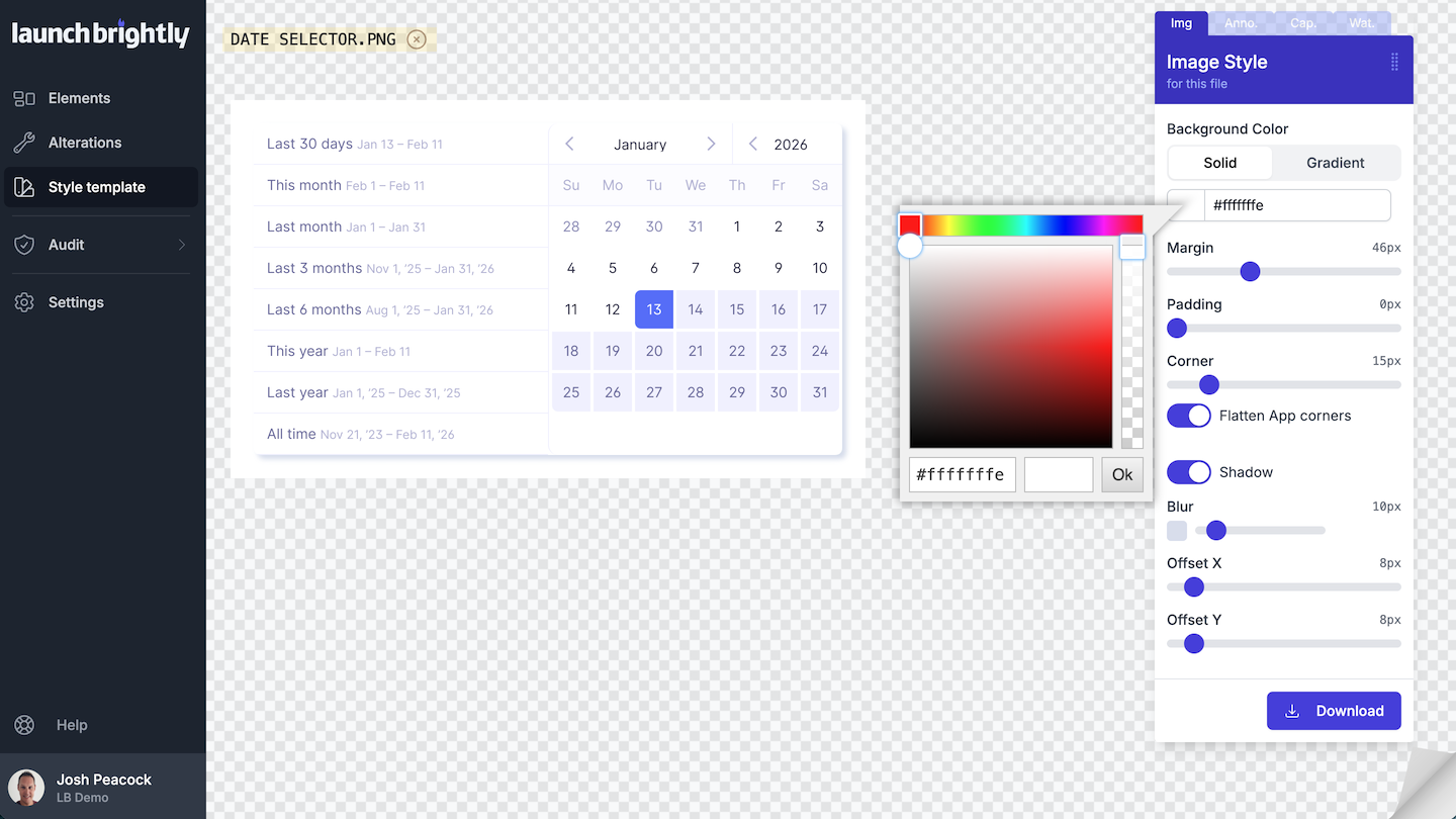
At LaunchBrightly we know that visual consistency matters. That’s why our fully customizable styling templates were designed to automatically apply visual enhancements to your screenshots, ensuring consistent styling on each and every screenshot.
Create physical space for your annotations
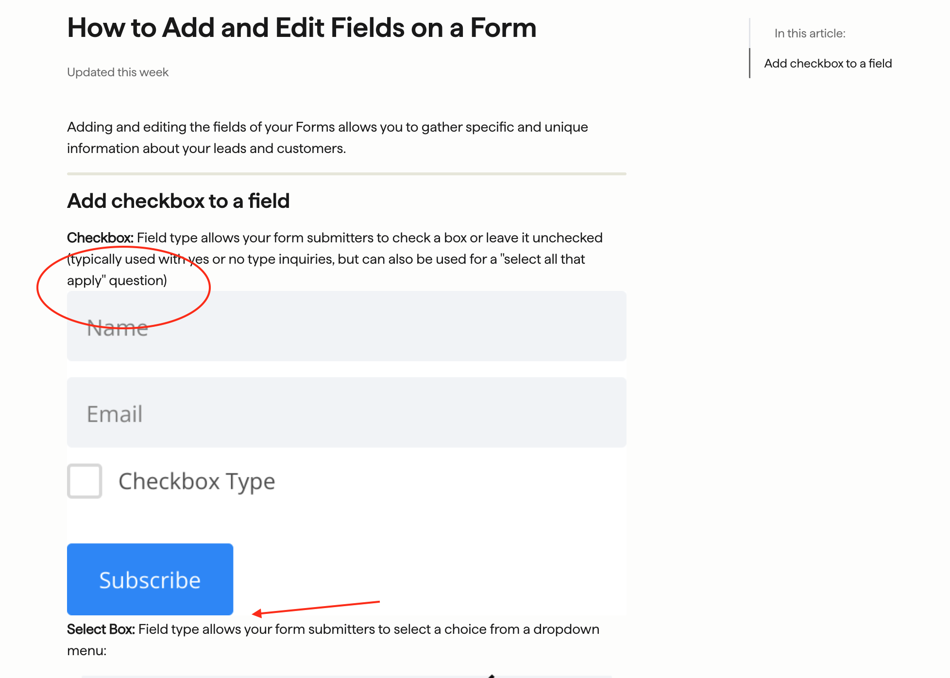
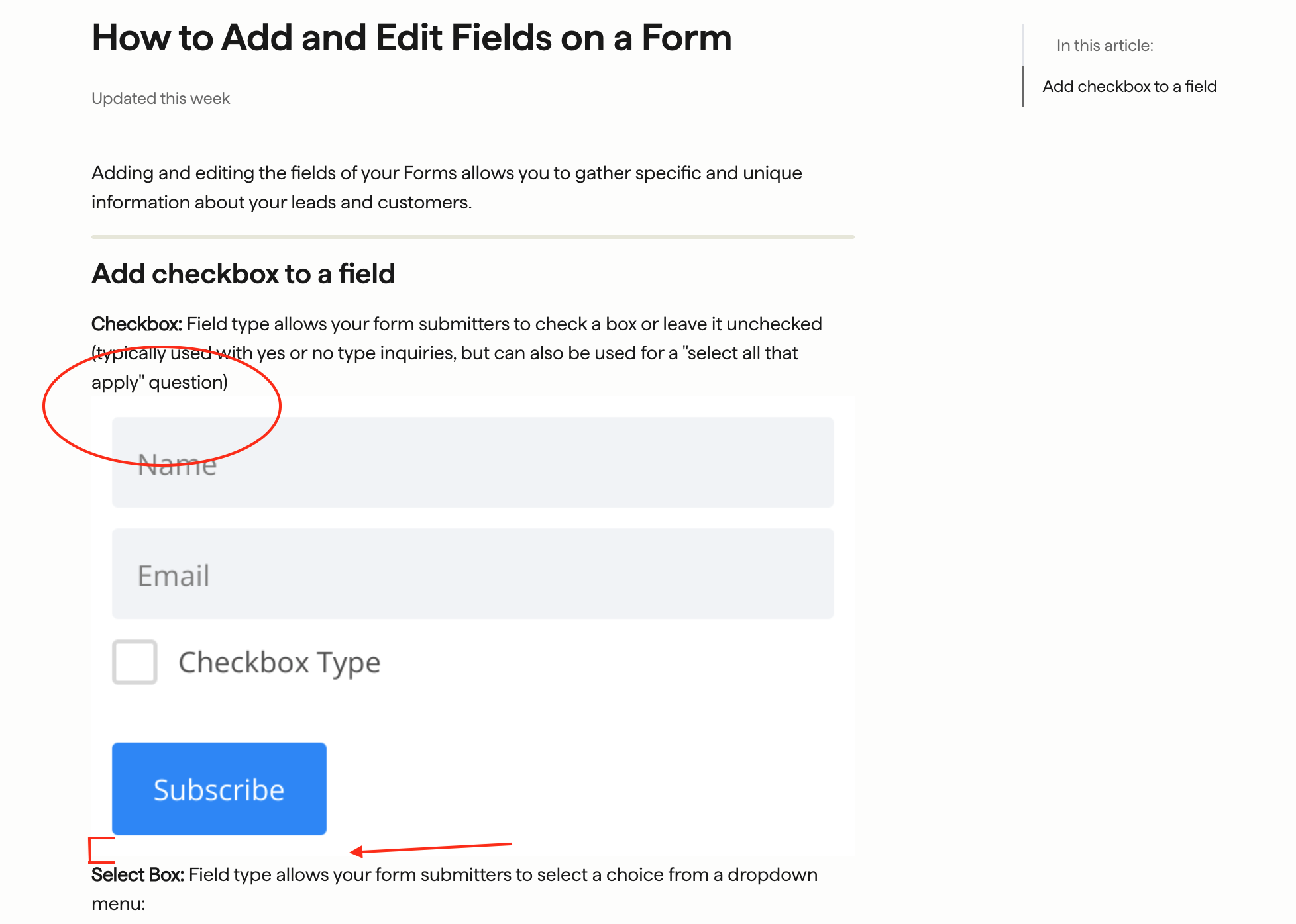
This is where zero-margin screenshots most clearly break down. Annotations — arrows, outlines, callouts, labels and other visual cues — need space to breathe. When an annotated element sits close to the edge of capture, there’s simply nowhere for those annotations to exist without being clipped, crowded or visually compromised. In short, effective annotations often depend on margin to exist at all.
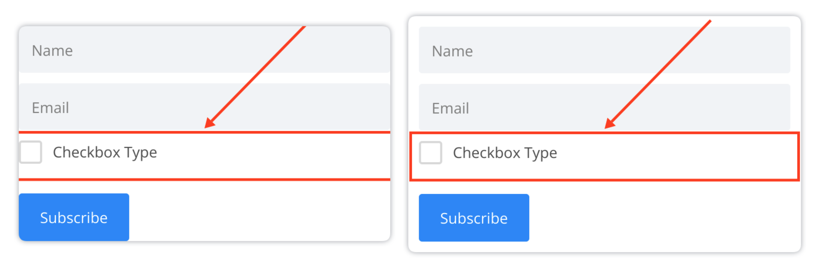
To help prevent annotations from being clipped or hidden, LaunchBrightly includes built-in safeguards within our custom style templates to provide alerts and surface user guidance when margins are set to 0px — helping to avoid potential unintended visual issues before they happen.
Visual inconsistencies across responsive layouts and embeds
Even if a screenshot looks perfectly fine in one context, it is important to consider how the visual appearance will change if the context is resized, repositioned or viewed on a different device. Narrow viewports, inline image scaling, CMS-specific padding rules and mobile rendering quirks can all influence how a screenshot is presented outside of its original environment. Edge-to-edge captures are especially vulnerable in these scenarios, as screenshots can often appear clipped, pressed against containers or visually broken as it adapts to a particular layout. Without any surrounding whitespace, there’s no margin for error — literally.
Creating the visual effect of having no margin
That’s all well and good, you might say — but I strongly prefer how my screenshots look without a margin. The good news is you don’t have to give up that visual intent. By pairing your margin with a background color that matches your help center exactly — or, better yet, using a transparent background — you can maintain a clean, marginless appearance once screenshots are embedded. This approach allows images to blend seamlessly into your existing layout while still providing the buffer needed to support annotations, responsive layouts and downstream reuse. You keep the look you want, without exposing your documentation to the hidden downsides of truly zero-margin screenshots.
Calculate your recommended minimum margin
Your annotation styling provides a practical baseline for determining how much margin your screenshots need. A simple rule of thumb is to set the screenshot margin to at least the combined size of your annotation’s inner offset and its outline width. For example, if your annotations use a 12px inner offset and a 6px outline, your minimum recommended margin is 18px. Adding an extra pixel or two on top of that is a sensible best practice, giving annotations room to render cleanly without risking clipping or visual tension.
Note: LaunchBrightly automatically builds the recommended minimum margin into our custom style templates as a safeguard against unintended visual issues like clipped or invisible annotations.
Conclusion
Screenshot margins are easy to overlook, but they’re far from a cosmetic detail. They shape how your documentation is read, how well effectively annotations communicate and how seamlessly your visuals adapt as they move across different articles, layouts and devices. In practice, margins act as quiet infrastructure — providing clarity, flexibility and consistency.
If you’re refining your documentation workflows, margins are one of the highest leverage places to start. A small adjustment at the time your screenshot is captured can prevent a long list of potential downstream issues that are difficult to fix once your screenshots are in use. And with LaunchBrightly’s screenshot automation platform, you can adjust your screenshot styling at any time, auto-generate all your screenshots with a single-click and automatically sync those updated images directly to your help center — keeping your documentation polished, consistent, and always up to date.
Want to see how your corporate identity and other styling choices can be automatically and consistently applied to all of your screenshots? We’d love to show you what this looks like in real life 🙂