By Josh Peacock In Best Practices, Screenshots, Automation | August 2026
Best practices for product screenshot annotations in your documentation
A closer look at why the small styling decisions behind your annotations — shapes, arrows, text and other callouts — have an outsized impact on how well your documentation communicates, and a practical guide to getting them just right.
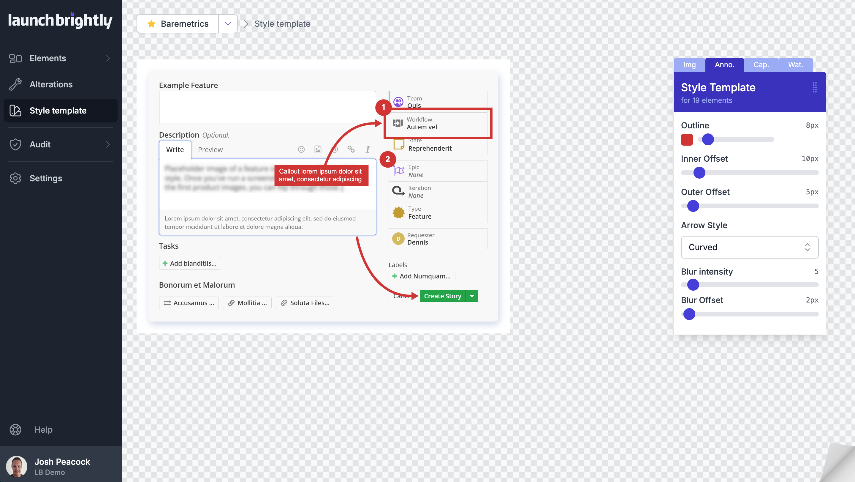
Product screenshots are one of the most effective communication tools in your help documentation. Long before your customers finish reading the article text, they've already looked at the screenshot to orient themselves, confirm they’ve landed on the right article to solve their problem and build confidence they’re following the correct workflow.
That's exactly why annotations matter so much.
A thoughtfully placed arrow, outline or callout doesn't replace your written instructions, and it isn't there simply to make a screenshot look more polished. Its job is more specific than that. Good annotations direct your customer's attention to exactly the part of the interface that matters, helping them absorb information faster and reducing the effort required to complete a task. They bridge the gap between what your customer is reading and what they're actually seeing on screen.
Like every aspect of good documentation, annotations work best when they're used with intention. Styling choices that seem minor on their own — annotation color, spacing, margins, outline thickness — can have a surprisingly large impact on how easy your screenshots are to understand. Get those decisions right and your documentation feels clean, professional and intuitive. Get them wrong and annotations start competing with your interface instead of complementing it.
One pattern we see often when working with documentation teams is that annotation styles tend to evolve organically rather than deliberately. One teammate favors thick outlines. Another prefers arrows over rectangles. Someone else picks annotation colors that closely match the product's branding. None of those individual choices are wrong, but together they create a visual language that shifts from article to article. And over time, that inconsistency makes documentation feel less cohesive than it should.
The good news is that effective annotations don't require design expertise. A handful of principles, applied consistently across your documentation, can meaningfully improve both readability and maintainability. Here's what we've learned while helping teams automate and maintain thousands of product screenshots.
Treat annotations as part of your documentation style guide
Most documentation teams invest considerable effort in creating editorial standards. They establish conventions for headings, terminology, capitalization and tone of voice so every article feels like part of a consistent knowledge base. Your screenshots deserve exactly the same level of consideration.
Annotations aren't independent design elements that happen to sit on top of an image. They're an extension of your documentation itself. Every outline, arrow and callout shapes how your users interpret information, and they should follow a consistent visual language no matter which article they're reading.
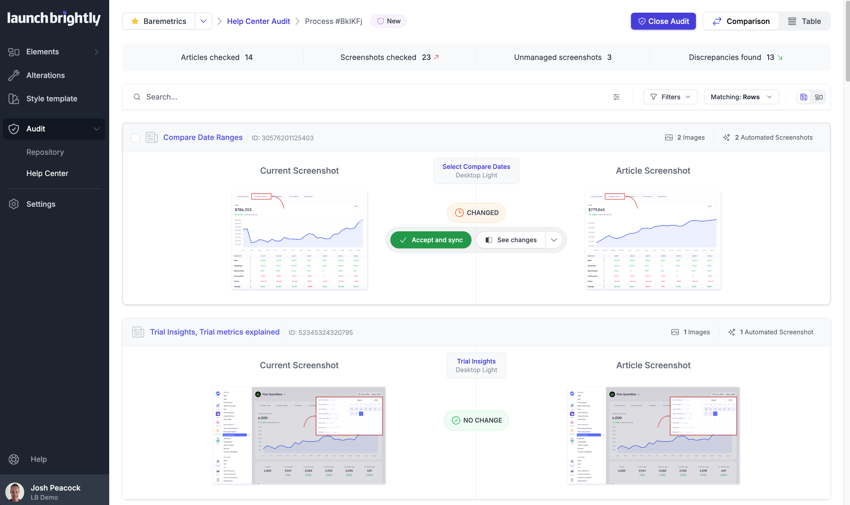
The strongest documentation teams we've worked with standardize their annotation styles across their entire help center — consistent colors, outline widths, arrow styles, typography and spacing, so every screenshot communicates the same way. The result isn't just documentation that looks more polished. It also becomes easier for your customers to navigate because the visual language stays familiar throughout their learning journey.
Consistency pays off for your documentation team too. Once styling decisions are made, authors can spend their time creating great content instead of re-deciding a dozen visual details every time they capture a new screenshot.
Create space for annotations to communicate clearly
One of the more overlooked parts of screenshot design has nothing to do with the annotations themselves — it's the space around them.
Documentation teams often try to capture screenshots as tightly as possible around the relevant interface element. At first glance, this feels efficient: the screenshot is smaller, there's less surrounding whitespace and the important part of the interface appears larger in the frame.
The problem is that screenshots rarely exist in isolation. They get embedded into help articles, resized across responsive layouts, viewed on different devices and, most relevantly here, annotated. The moment you start adding arrows, outlines and labels, a tightly cropped screenshot runs out of room fast.
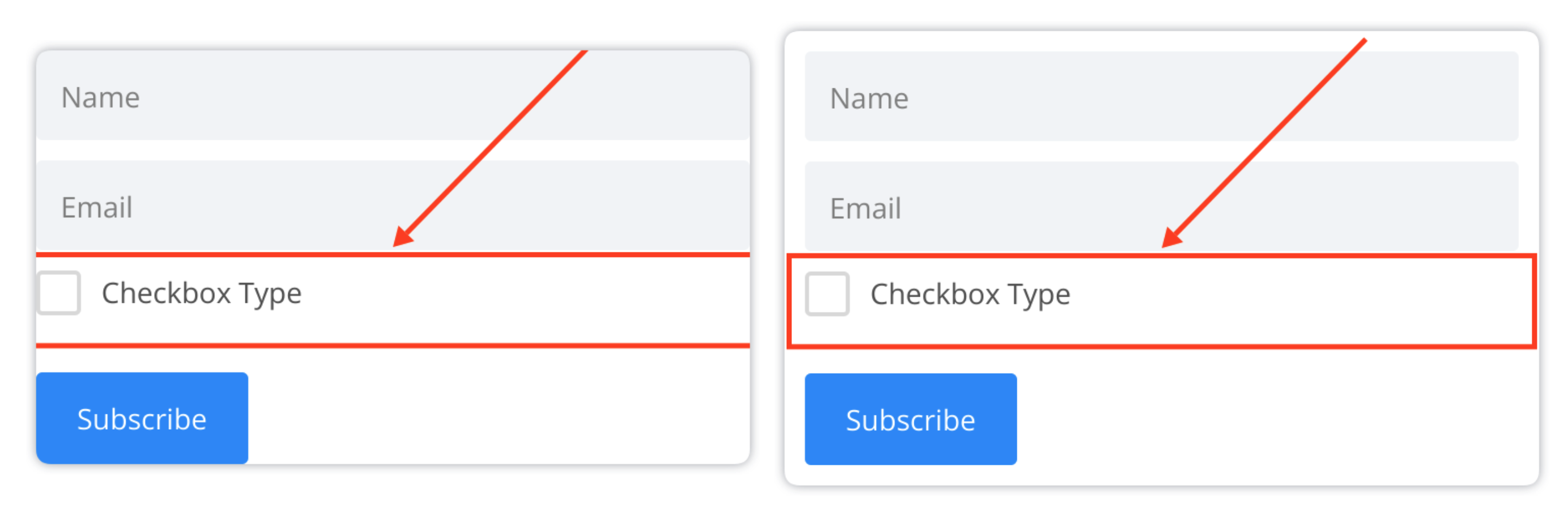
Margins give annotations the visual buffer they need to exist comfortably around the interface, rather than feeling cramped or clipped against the edge of the image. Rather than thinking of margins as wasted space, it’s more helpful to think of them as reserved space for communication — the breathing room annotations need to guide your reader's attention while keeping a balanced, professional look.
The same logic applies to annotation offset — the distance between an annotation and the interface element it's highlighting. Too close, and the screenshot feels crowded. Too far, and the visual relationship weakens, forcing your customer to work harder to connect the annotation to the right element. As a practical rule of thumb, set your annotation offset to at least the width of your outline plus a small buffer. A 6px outline, for example, typically calls for an offset of around 6–8px to keep enough separation without losing the visual connection.
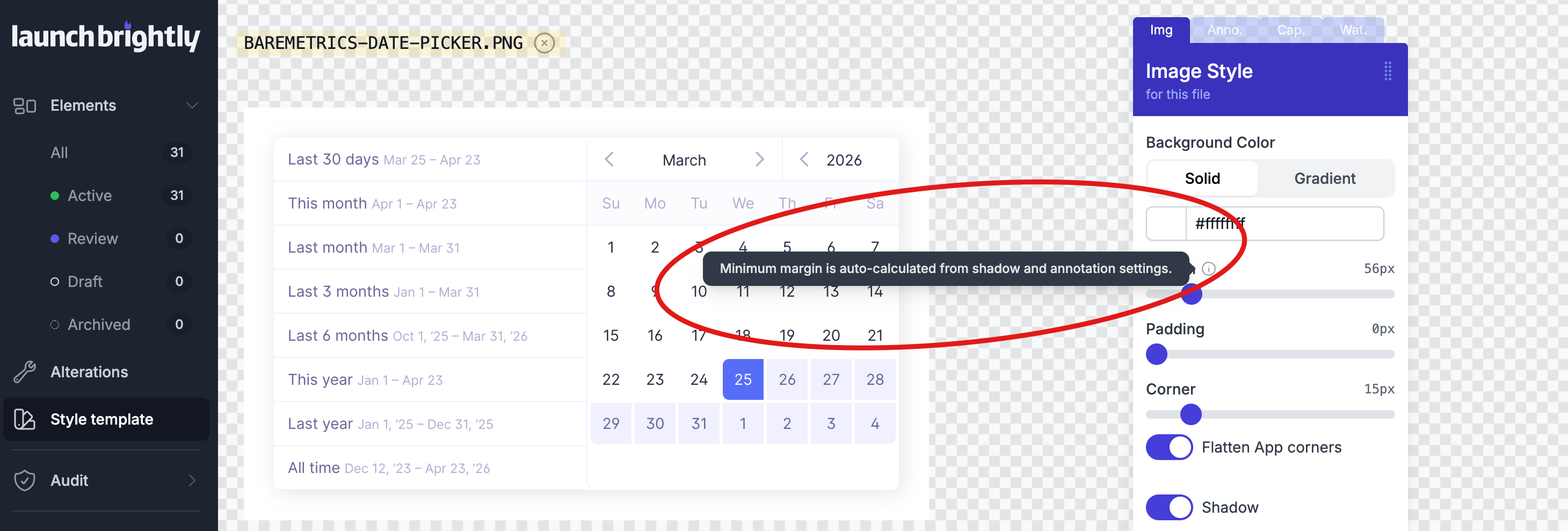
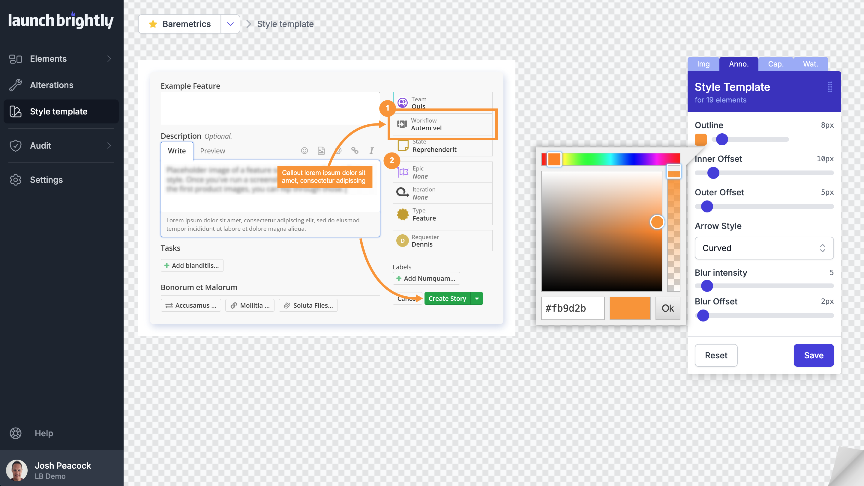
We built this thinking directly into LaunchBrightly's Custom Style Templates. Rather than asking authors to calculate margins by hand, the platform automatically determines a recommended minimum screenshot margin based on your annotation settings, helping catch clipped or partially hidden annotations before screenshots ever get published.
Choose annotation colors that stand apart from your interface
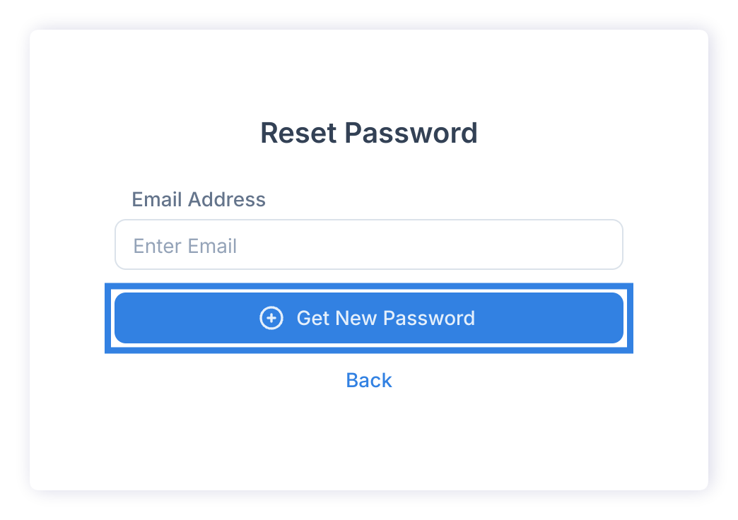
It feels completely natural to use your company’s primary brand colors for annotations. If your application already uses a distinctive blue, green or indigo throughout the interface, extending those colors into your screenshots seems like the obvious choice. After all, it reinforces your brand identity and creates visual consistency.
In practice though, we’ve found the opposite is often true.
An annotation's job is to draw attention to one specific part of a much larger screenshot, and it can only do that if it's immediately recognized as something intentionally added to the image. Richard Mayer's Signaling Principle, from his work on multimedia learning, describes exactly this: visual cues help people focus on what matters while reducing the cognitive effort needed to figure out what to look at.
When annotation colors closely resemble colors already used throughout your product interface, that distinction starts to disappear. An outlined button, highlighted menu item or colored rectangle can begin to look like part of the application itself rather than an instructional aid layered on top of it. Instead of helping users focus, the annotation introduces a subtle moment of uncertainty as they subconsciously interpret whether they’re looking at part of the UI or part of the documentation.
Rather than choosing colors that blend into your interface, we generally recommend selecting an annotation color that’s clearly distinct from your application’s visual language. Bright reds, oranges and other high-contrast colors often work well because they’re immediately recognised as annotations rather than interface components. The goal isn’t to make your screenshots louder or more dramatic. It’s simply to remove any ambiguity so your customers instinctively understand what the documentation is asking them to focus on.
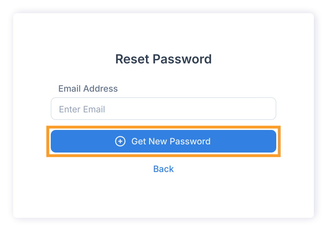
Color isn’t the only tool available for creating emphasis either. Small adjustments to outline thickness, for example increasing from 6px to 8px, can significantly improve visibility without making annotations feel overwhelming. Often it’s the combination of thoughtful color selection and subtle styling changes that creates the clearest result.
Consistency gets harder — and more important — as documentation scales
It’s relatively easy to maintain visual consistency when your knowledge base contains twenty articles. It becomes considerably more difficult when you’re managing hundreds of articles, multiple documentation authors and a product that’s continuously evolving.
This is where annotation standards become much more than a design preference. They become part of the operational process behind maintaining high-quality documentation.
Most documentation teams rarely notice inconsistency while they’re creating screenshots. Each individual screenshot looks perfectly reasonable on its own. The inconsistency only becomes apparent months later when those screenshots are viewed together across an entire help center. Different outline widths, slightly different colors, varying arrow styles and inconsistent spacing gradually accumulate until the documentation no longer feels like it was created as one cohesive experience.
The simplest way to avoid this is to remove as many styling decisions from the day-to-day authoring process as possible. Rather than asking every author to remember which colors, margins or outline widths to use, establish those standards once and apply them automatically across every screenshot you generate.
That's the philosophy behind LaunchBrightly's Custom Style Templates. Instead of styling screenshots individually, your visual standards become part of the automation itself. Every screenshot generated follows the same annotation colors, margins, outlines, shadows and styling rules, ensuring your documentation remains visually consistent regardless of who generated the screenshot or when it was created.
Think beyond today's screenshot
Creating a beautifully annotated screenshot is only half the challenge. The other half is keeping it accurate as your product changes.
Every documentation team runs into the same problem eventually. A product update moves a button, renames a menu item or reworks a flow. All of sudden every screenshot and every annotation attached to those screenshots now needs to be recreated. That’s one of the reasons annotated screenshots have traditionally been so expensive to maintain. The annotations themselves often require as much manual effort as capturing the original image.
We've always believed annotations shouldn't disappear the moment your interface changes. With LaunchBrightly’s NextGen Screenshot Recipe Builder, annotations become part of the screenshot automation recipe itself. As you record a workflow, you can add outlines, arrows, labels, text and other visual enhancements directly within the recipe. Those enhancements are then automatically reapplied every time the recipe is reprocessed to generate a fresh screenshot.
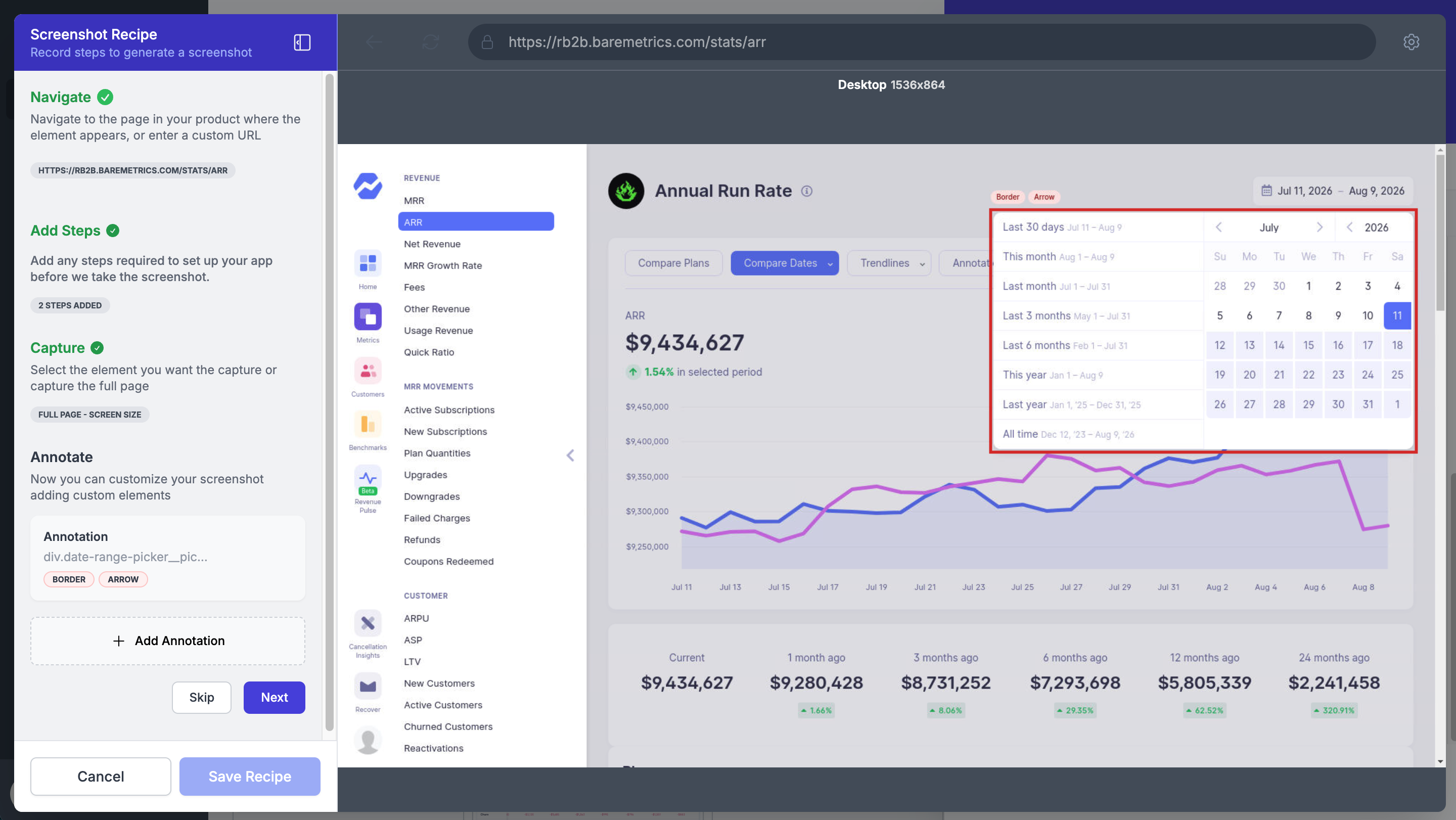
That fundamentally changes the maintenance workflow. Instead of recreating annotations after every product release, you’re simply regenerating your screenshots. The styling remains consistent, the annotations remain aligned with your documentation standards and your screenshots stay current as your product evolves.
Focus attention, don't overwhelm it
Perhaps the most important annotation principle is also the simplest: annotations should clarify a screenshot, not compete with it.
When every button is outlined, every field has a callout and every menu has an arrow pointing towards it, the screenshot quickly becomes visually overwhelming. Rather than helping customers identify the next step, the annotations themselves become another layer of information to interpre
The strongest annotated screenshots we see tend to show real restraint. They highlight only the elements essential to the task at hand and let everything else fade into the background. That selective use of annotation keeps screenshots clean, directs attention with purpose and reduces the cognitive load on your customer.
The goal was never to explain every part of the interface. It's to guide your customer toward the handful of elements that matter for the task they're trying to complete at that moment.
Conclusion
Great annotations don't just make screenshots look better — they make documentation easier to understand. Small decisions around color, margin, spacing and styling shape how quickly your customers absorb information and how confidently they move through your product. Applied consistently, those decisions build a visual language that quietly supports every article in your knowledge base.
Just as important, those standards need to be easy to maintain as your documentation grows. When annotation rules live inside your screenshot automation instead of inside your authors' memory, consistency scales right alongside your product.
That's exactly what we've set out to build at LaunchBrightly. From fully customizable style templates and automated annotations, to recipe-based screenshot regeneration and direct help center syncing, the platform lets documentation teams get their screenshot styling right once — and keep it that way as the product keeps changing.
Want to see how consistent annotation styling can be automatically applied across every screenshot in your help center?
We'd love to show you how LaunchBrightly helps documentation teams automate screenshot generation, and keep every screenshot in your help center consistent and accurate as your product evolves 🙂